Alpha Echelon


Identity
–
Alpha Echelon
Alpha Echelon is a new found consulting firm focused on advising and investing in small to medium sized businesses. A credible firm with vast experience successfully launching new businesses internationally. Alpha Echelon focuses on businesses that are transformational in some way; either in the way they use technology to transform a business model or in the way the business model allocates its resources.
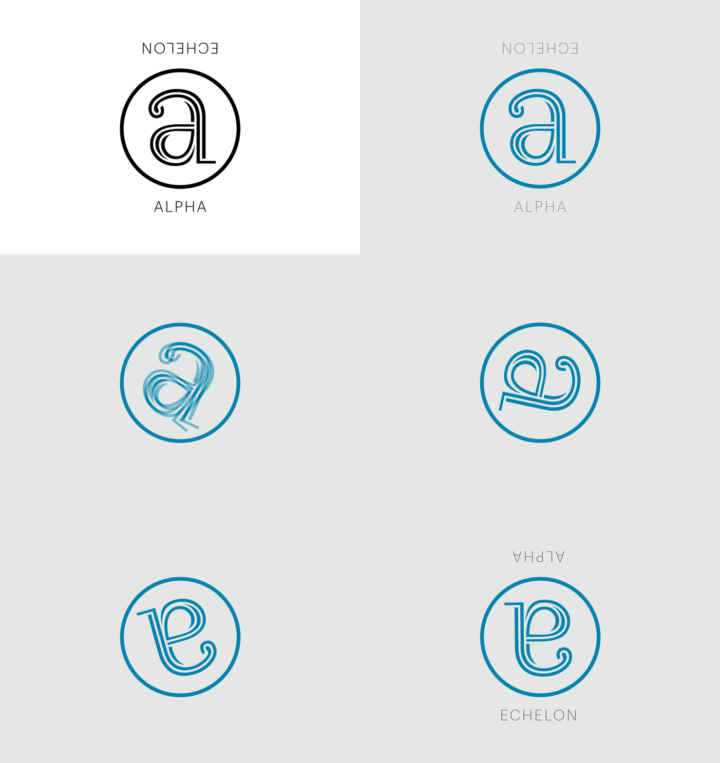
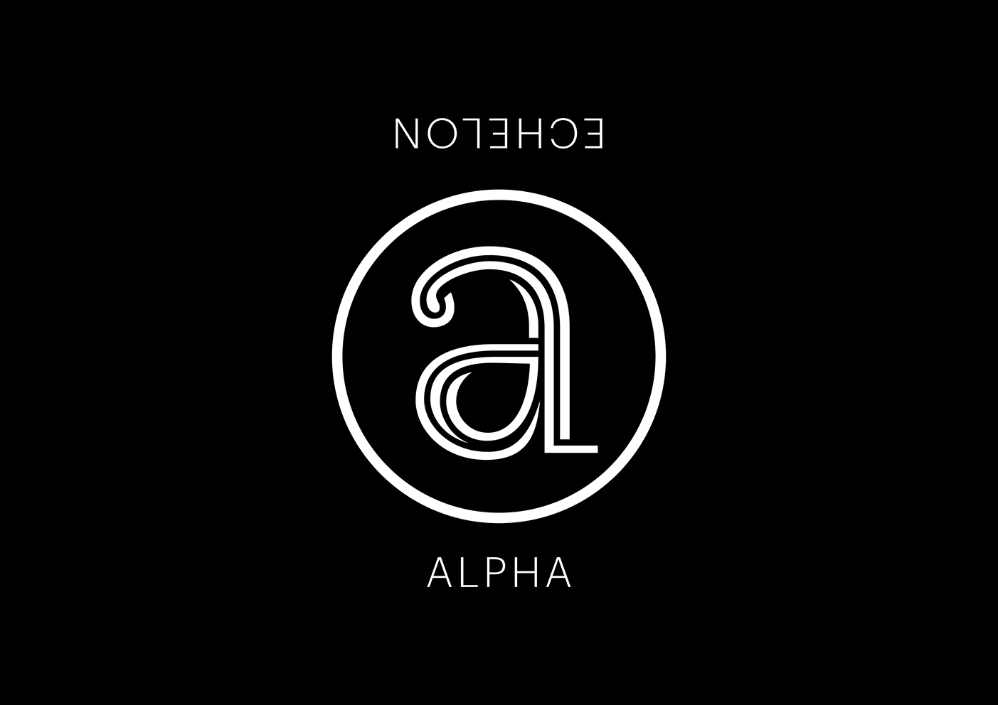
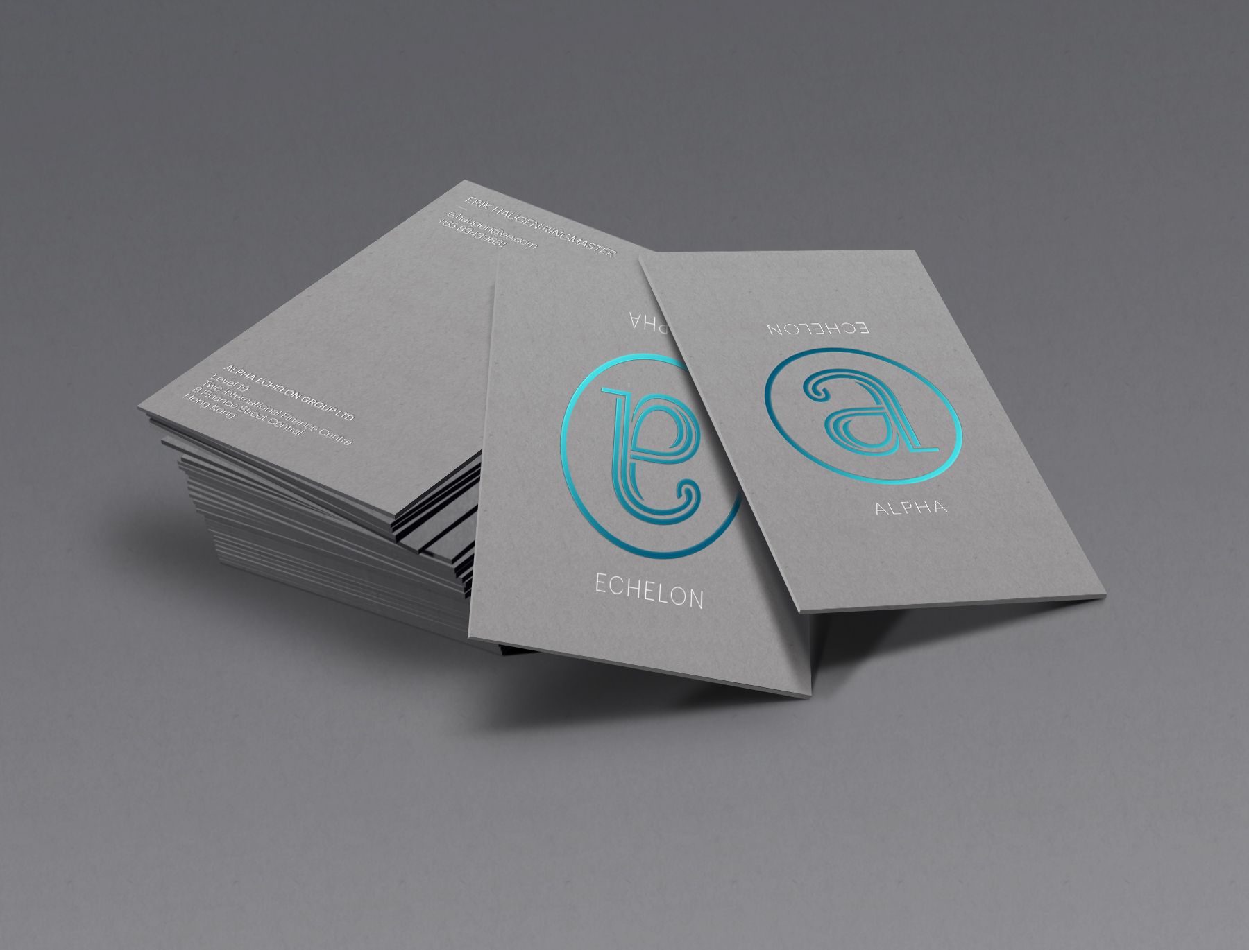
We devised a simple, impactful geometric identity by fusing both lowercase letters ‘a’ & ‘e’, each letter viewed separately when rotated. This idea alludes to the notion of seeing things differently and suggesting the ability to transform—which succinctly positions the firm’s manifesto and business offering. The identity and art direction was applied progressively to their corporate stationery and interim website.
The typeface used here—’Ryman Eco‘, in particular is a free eco-friendly typeface, designed by Monotype’s Dan Rhatigan. Described as “the world’s most beautiful sustainable font”, Ryman Eco’s characters are made up of fine key lines rather than a single solid stroke; 33% less ink than standard fonts. The ideation of this typeface clearly resonates with Alpha Echelon’s personality.
(More to come soon…)
—
Art Direction & Design at Qube
—
© UNIT Studio | All rights reserved
