
Peter Saville: How to rebrand a fashion label

“The interesting and debatable issue that spins off from this is the current culture of brand obsession. Some of the appeal is obvious, like status and security – which is endorsed by the signifier – but people also seem to be enjoying the aesthetics of typography. It’s gone from that scene in American Psycho of merely comparing business cards and become a cultural fixation. I grew up liking graphic art and learned to see that there was an extraordinary elegance and beauty in type, and some of that appreciation has entered the public domain now. Because it’s not just that it says Balenciaga – the whole composition has become a new aesthetic.”
–
“The current obsession for typographical art, as seen at Virgil Abloh’s Off-White, is entrenched in the new democracy of fashion. If we go back just 20 years, there was still a hierarchy that said what fashion was. Now it’s part of the everyday and there are entirely populist icons.”
— PETER SAVILLE
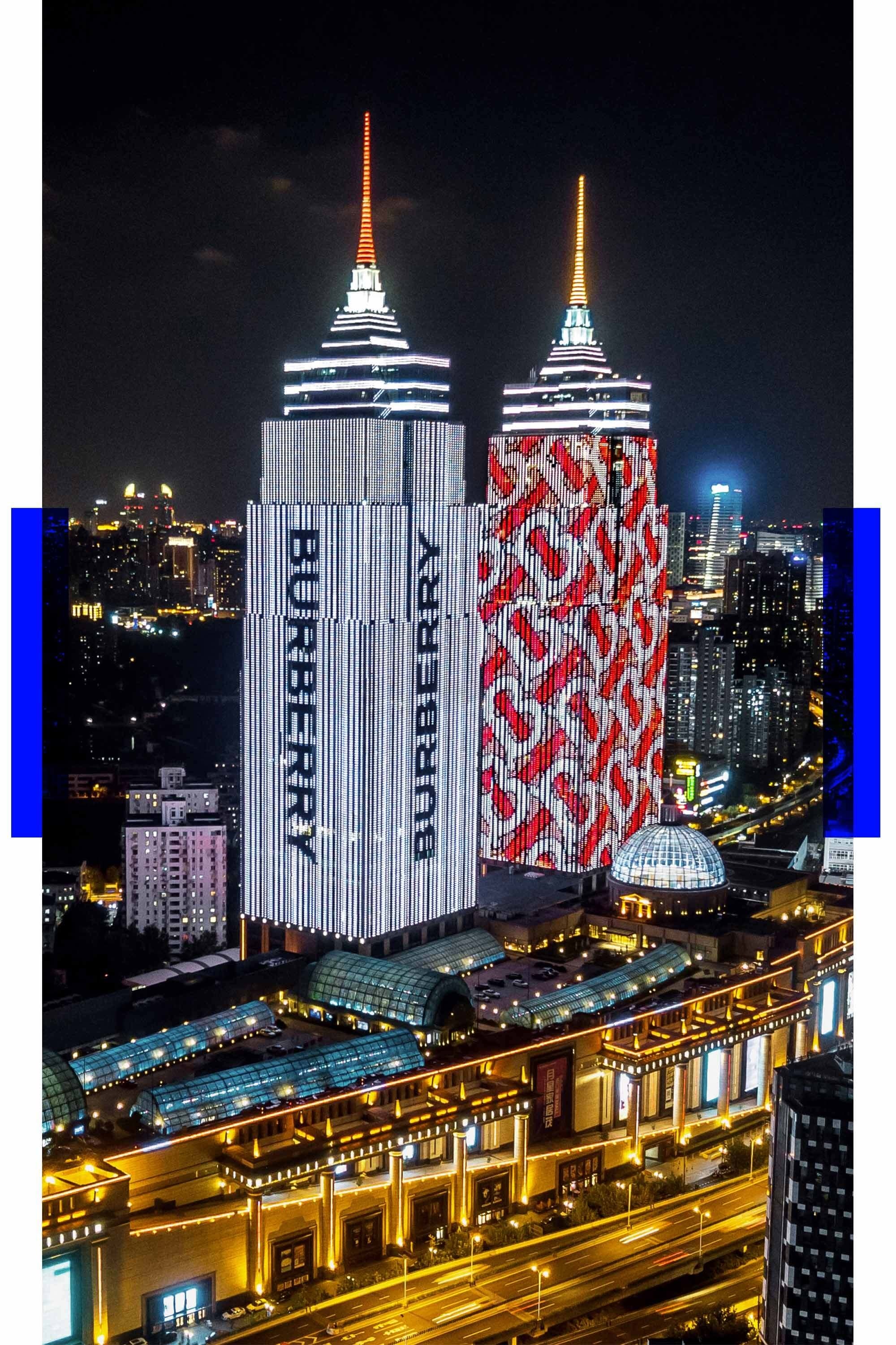
Peter Saville talks to Vogue Business about the process of redrawing the logos of internationally famous brands – and how fetish and the Badminton Horse Trials inspired his Burberry sans serif.
(via Vogue Business)
—