UNIT Redux


Who needs to see another bloody new identity right? Well, enough with the vitriol that’s spewing from Twitter and social media platforms. It’s been twelve years since I started UNIT as a commercial studio, after putting it on hiatus to embark on a bittersweet experience with the bigger boys. I still look back fondly on the identity and self-promo posters I collaborated with these brilliant minds (see below)—but we all have to move on.

UNIT Posters circa 2004.
Credits: Poster 2 – Collin Patrick, Black Photography / Poster 3 – Max Hancock, Diphthong Interactive / Poster 4 – Michael Ng, Mindflyer / Poster 5 – Wai Teik, Wai Teik Photography. Printed by AlsoDominie.
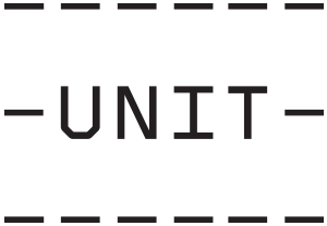
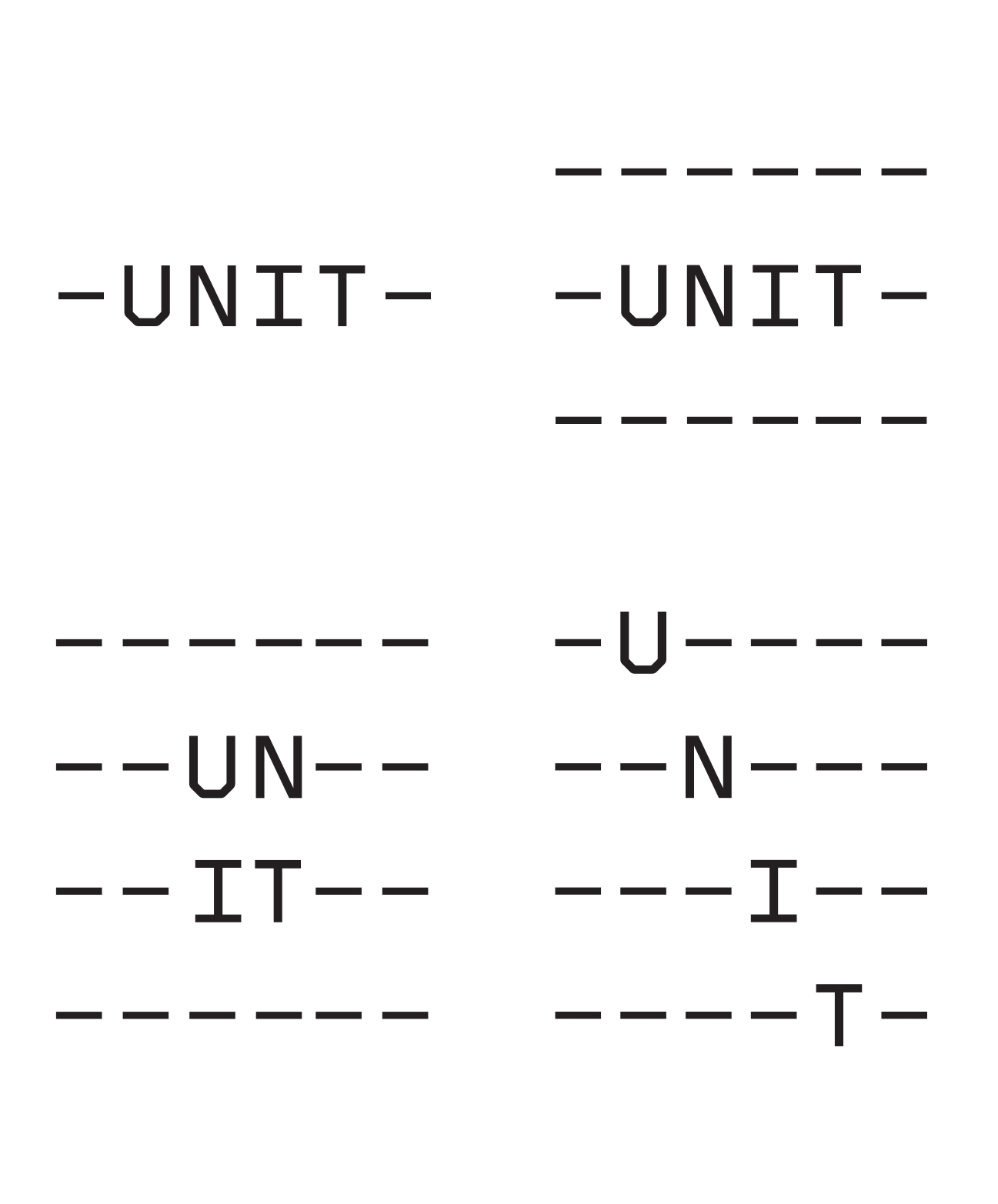
So here we are, a new year a new start. With the new identity, the idea is to employ typographic marks to amplify the idea of modularity. The hypen punctuation translates as ‘together’ in Greek. Fittingly as a concept, the hyphen in the identity is a symbol of connecting parts, alluding to collaboration and unity. This is synonymous with the studio’s name and corresponds appropriately with my working ethos. Foundry Gridnik was selected again for it’s monospaced qualities. As a recitation, the typeface characters were based on a square grid. You can see the versatility of this at the top left-hand corner of the page where the identity sits.
With this new typographic formation, these resulted in a typographic concept that includes variations and the ability to evolve, amplifying the idea of modularity. The use of black as a dominant colour exudes a no-nonsense personality and alludes to the word ‘mono’—the characteristic of the typeface. I should have thought of this sooner, but here’s the new identity in it’s full glory.
—