
Font Clock
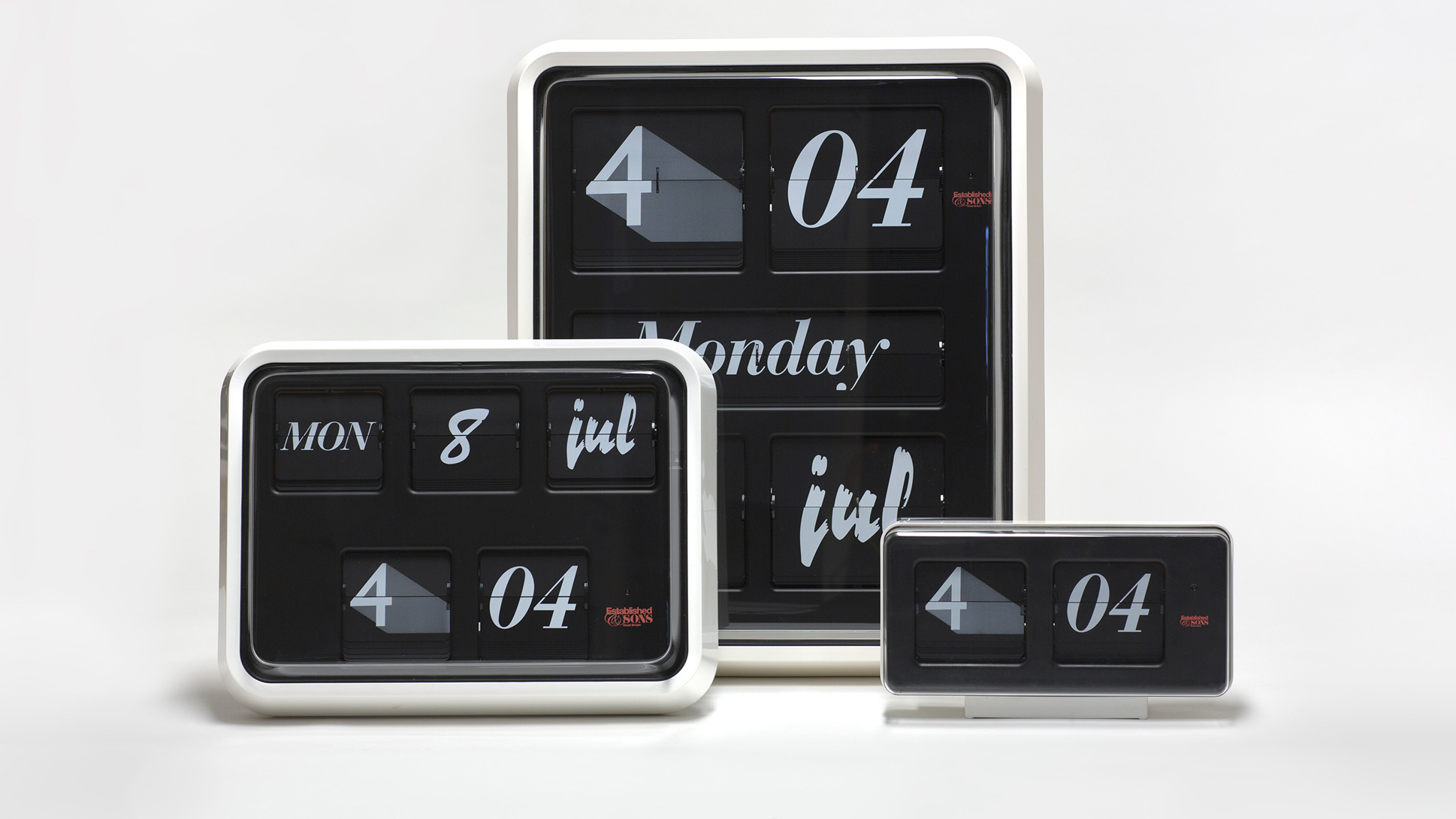
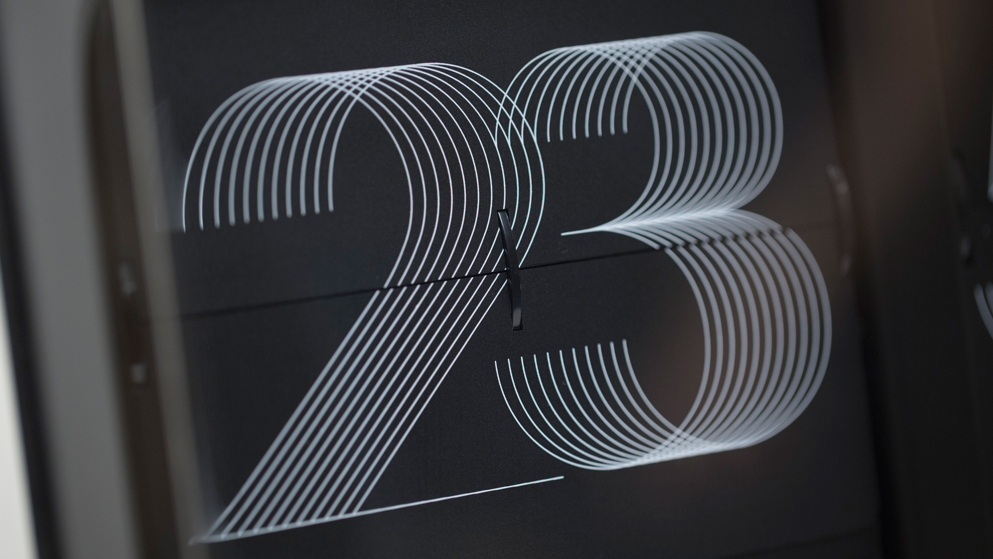
Typophiles rejoice! Beautiful piece from Sebastian Wrong, co-founder and design development director of Established & Sons. He approached British clock-makers Grayson with the idea to create an eccentric version of a classic timepiece. The Font Clock, which is available in three sizes, takes the iconic calendar clock with its distinctive form and flip mechanism and introduces a variety of fonts in an ever-changing display.
Working together with graphic designer Stefan Kraus, Wrong chose an eclectic mixture of 11 different pre-existing fonts to identify the time and date, with a focus on 20th-century type families such as Franklin Gothic and Helvetica.
(via Dezeen & Polimekanos)
—