WanderWonder: Redux

Brand Identity
–
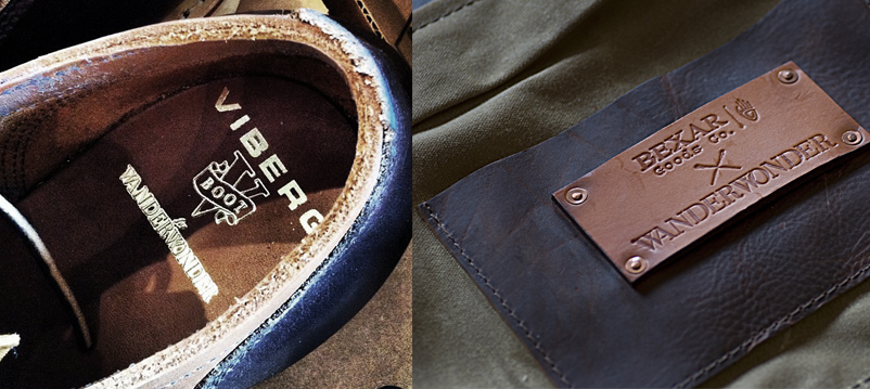
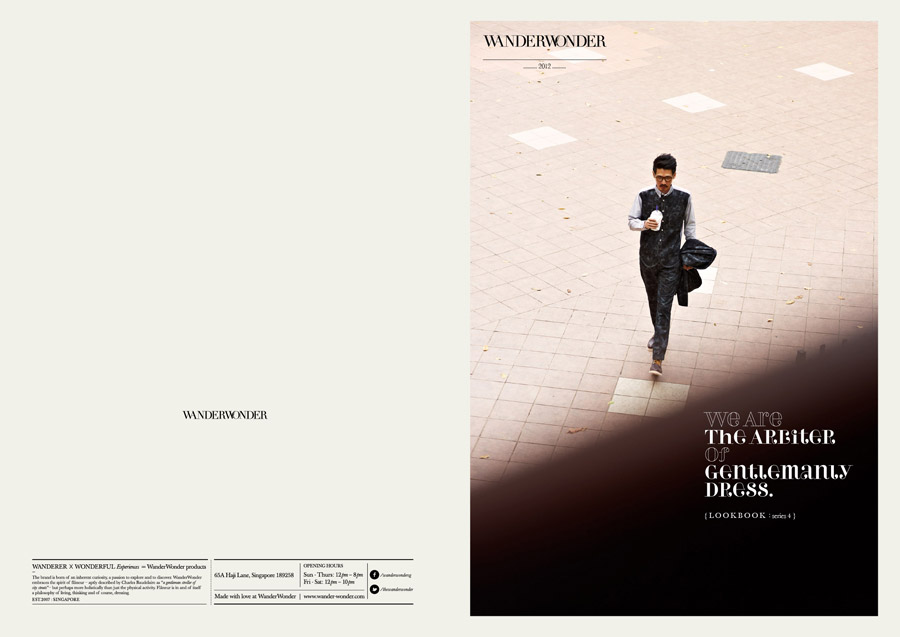
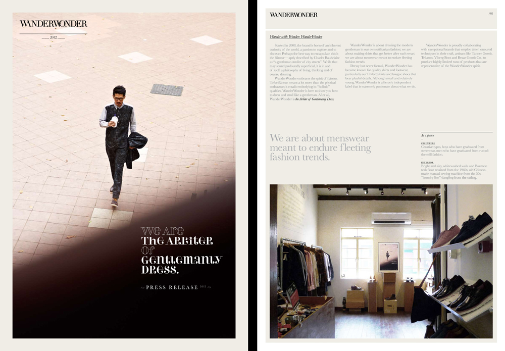
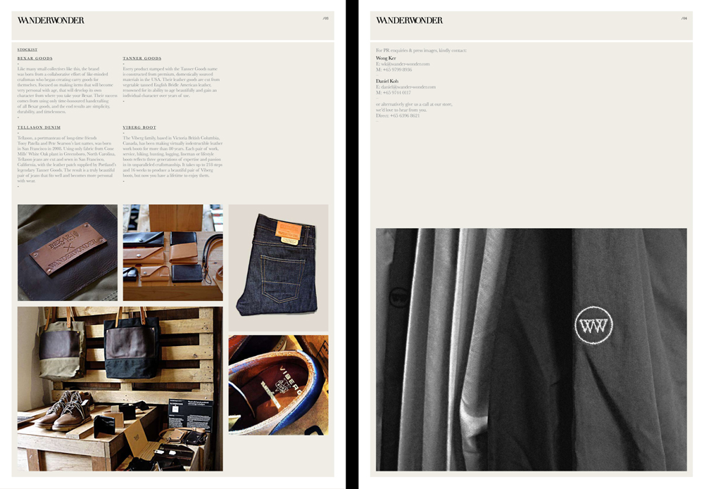
WanderWonder
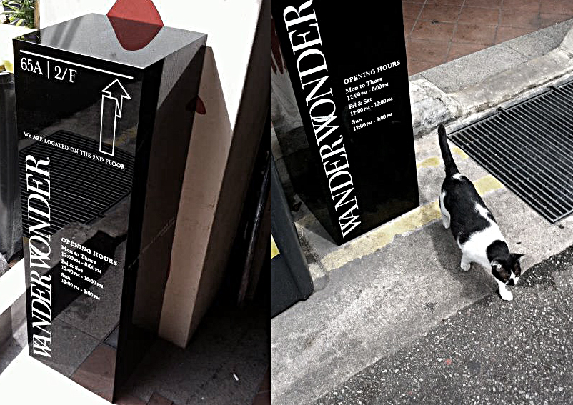
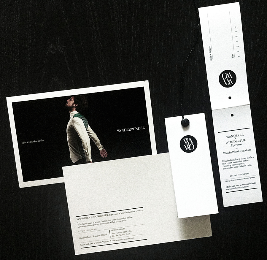
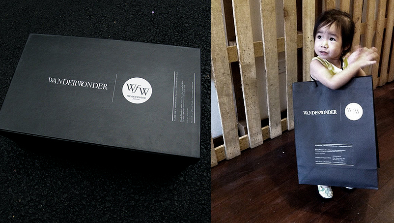
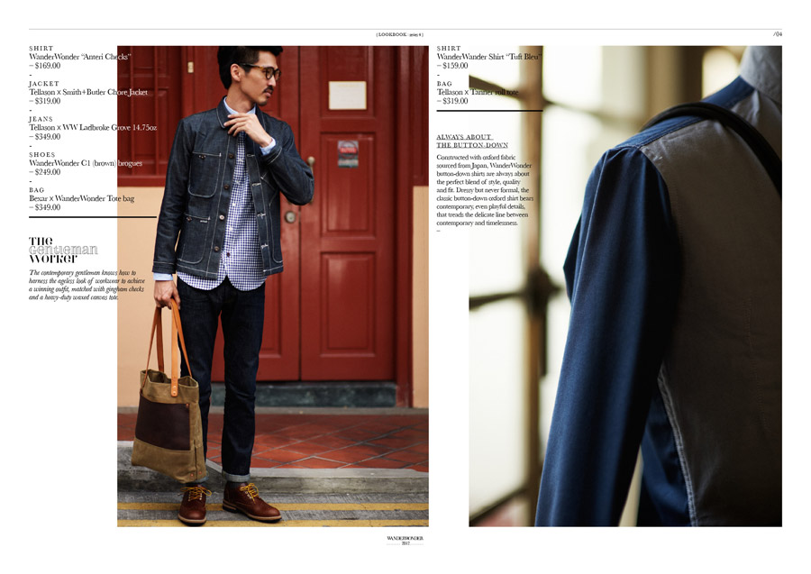
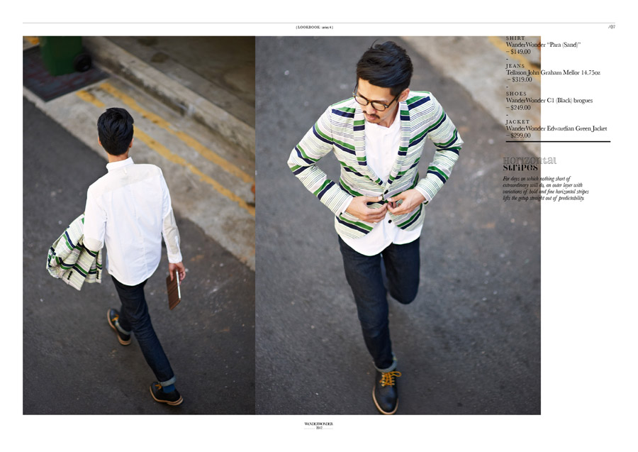
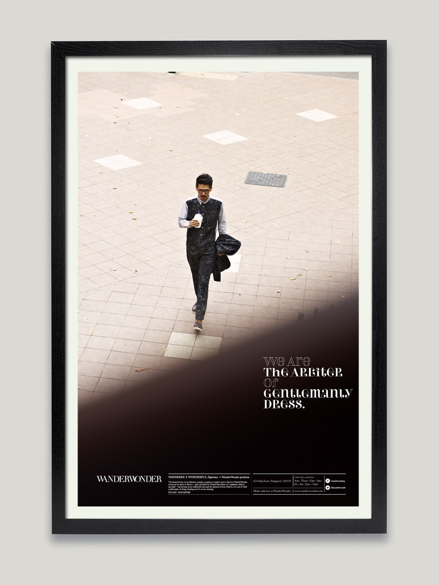
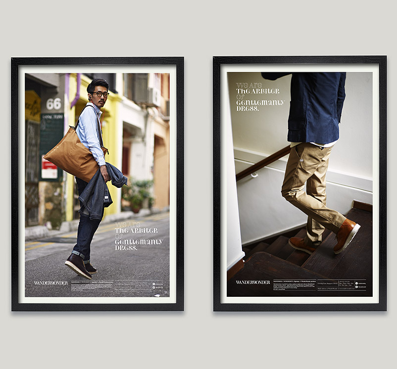
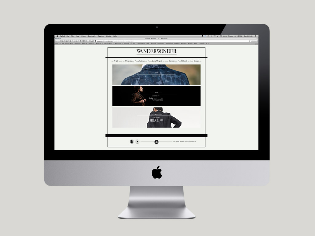
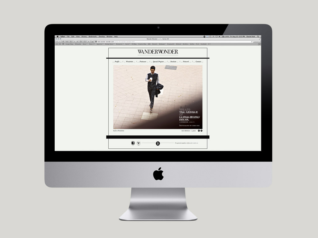
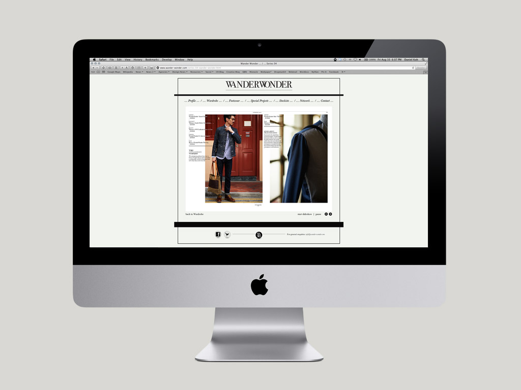
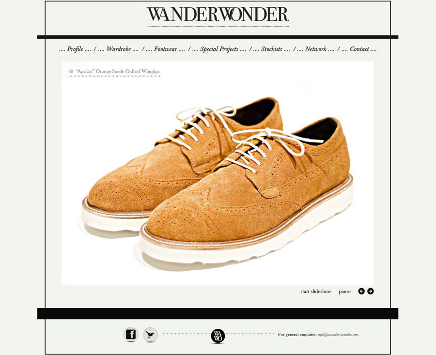
A simple, static logotype is no longer enough for the label; the identity has to function as a flexible system that supports
all broad applications across multiple platforms. A brand plate was designed to indicate different sets of information.
The black bar is a major element of the identity, used to anchor the typography and as a graphic device that indicates
necessary information. The current logotype was also updated – utilizing thinner serifs across the each letter.
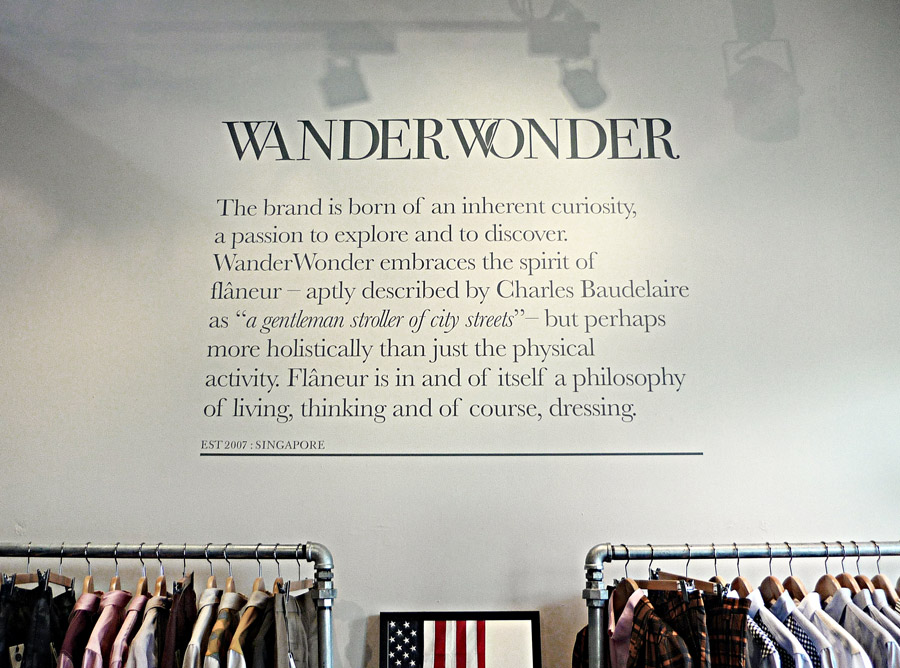
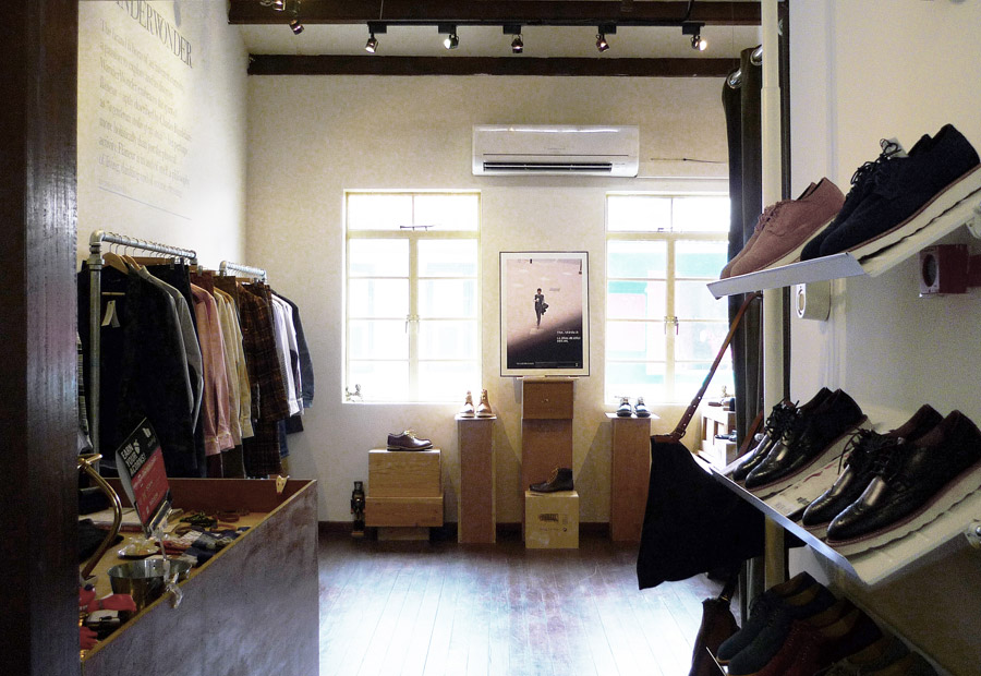
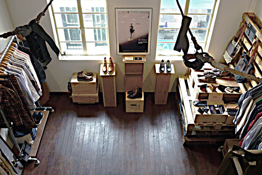
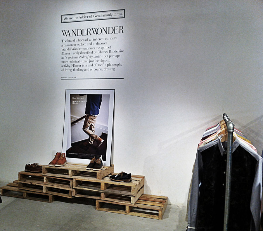
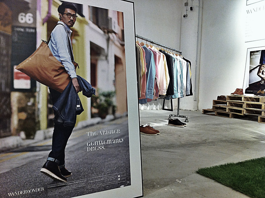
The flagship store, situated along Haji Lane, is the almost de-facto indie fashion locale of Singapore. A copious use of wood,
from the aged Burmese teak flooring to discarded wine crates and discarded pallets, gives the shop an idiosyncratic and
tactile approach.
–
Visit WanderWonder on Facebook.
Headline typography based on Perla from T.26 Type Foundry.
–
© UNIT Studio | All rights reserved
